Damn good albums need damn good album covers. Kerry King of Slayer once mentioned how the band’s music makes it sound as though the world is about to end, and artist Larry Carroll’s visual representations are not far off the mark. Carroll started collaborating with Slayer in 1986 and has painted four of their album covers so far. Some of those albums are among the best in metal, and so, I would argue, are the covers.
Carroll says he usually makes a collage out of drawings and photographs. This was before Photoshop was born, hence Carroll used a good ol’ Xerox machine to multiply, resize or otherwise manipulate the individual pieces. The coffins in Seasons in the Abyss are a good example.
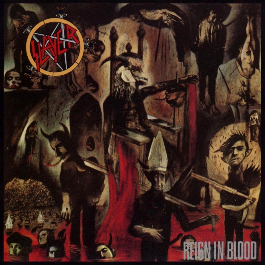
At the time of painting the Reign in Blood cover, Carroll was doing political illustrations for various newspapers, and had not done album covers before. Producer Rick Rubin contacted Carroll, who was left with more or less free reins, building upon “a rough idea of something about a goat’s head”. Once finished, however, it turned out that his unique style was not an obvious choice for Slayer. But once the mother of one of the band members commented that the painting looked “disgusting”, any doubts seem to have melted away (in a living inferno).
And sure enough: there is something nauseating about Carroll’s Slayer covers, as though they were depicting the sickest aspects of society of the 1980s. Not only could modern life come back to us in dreams as collages of twisted, disproportionate human shapes with pope hats and erect penises (cf. RiB), but the netherworldly use of colour in Carroll’s paintings was one of a kind. Black and red are the classic colours of blood/fire/death – Carroll’s black strokes are high-contrast burns reminiscent of coal or oil – but to this Carroll added revolting tints of green, brown and yellow, a fitting backdrop to the fires of mental hell.
But rather than depress us, Carroll’s paintings are majestic. Carroll shows that he, like Slayer, is fascinated by death, and, like some fallen Lucifer, makes a stroll south of heaven an enticing exploration of potential.
Tags: album covers, slayer


Third rate photoshop artwork (Illud Divinum Insanus, Behemoth) can’t compare to an early Dan Seagrave cover, for example (check out everything in Nocturnus’ The Key packaging). It’s a shame that with an album like Reign in Blood being so popular, bands can’t be bothered to at least want to come up with decent artwork for their music. Even simple image manipulation like on Darkthrone’s Total Death is more memorable (striking) than some expensive recent Roadrunner records album cover. The Disma album looked cool (musically dull though), but everything else? Nothing really sticks out. It’s like every band has been using the same guy to make their album covers since 2005.
Always dug this cover since I picked it up when I was 12.
Goes perfect with the chaos that’s unleashed in audio form.
Artwork is almost as important as the music. In some ways, it sells the album to someone who never heard of the band. Iron Maiden won me with the cover of Powerslave at age 10!
Having done artwork and layout for bands and labels, I can tell you that 90% of them don’t care about artwork, or have any budget for artwork. They’re ready to spend tens of thousands on recording but they can’t spare a few hundreds on artwork. It’s a shame but also a reality.
Things are slowly changing, by chance, but I still can’t figure out why D. Riggs isn’t a millionaire like the rest of Maiden are. They owe him a good part of their career.
I always loved Michaal Whelan’s Art for Sepultura especially for “Beneath The Remains “, it’s one of the most beautiful cover art for a Metal Album
Kristian Wåhlin (Necrolord) has always been my personal favorite album cover artist. Something about the blues just gets me.
u guys are fags. this album sucks. the worst part is the shitty daddaist album cover. RiB is the beggining of slayers dabbling with modern aesthetics, visually as well as sonically. this is an obvious attempt by either slayer or def jam to make albums that are more palletable to the mainstream modernist listener.