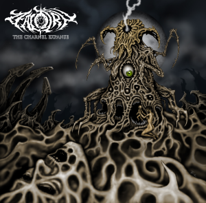
Boston’s Zealotry made a startling contribution to death metal in 2013 with their debut album The Charnel Expanse. Plodding, grim death metal inspired on the vague harmonic coloration of Immolation, the watery flow of tremolo-picked melodies of Adramelech and the syncopated off-feeling of Demilich. A non-explicit disciple of the abstract concepts underlying the strong and clear structural construction in the death metal of At the Gates’ Gardens of Grief, Zealotry’s offering makes strides in the direction of the ideal and whole technical death metal.
A superficial glance over the record can give the impression that this is a retro band and that this is an “old school death metal” record. The only truth in that remark lies solely on the fact that Zealotry picks up where old school bands left off before death metal hit rock bottom in the mid 1990s only to branch out helplessly in a multitude of retrograde subgenres. Zealotry shows us the way the obsession with technique and extremity in performance of the genre at the time (which became its focus roughly after 1992) could have been channeled into the sculpting of true works of art rather than demonstrations of narcissism and inadequacy.
Condensed into one sentence, the reason why this effort falls short of its mark is related to the how monumental that goal is. Were they to pull off the record they were looking for, it would have single-handedly given the current death metal landscape an example to follow and at the same time it would have marked the end of a chapter in the genre.
But the naivete that cripples The Charnel Expanse gives the metal student a clearer study of death metal construction. The way each riff and section is rounded off and resolved makes the record overbearingly predictable. The thoughtful enchantment of each next riff is what allows the listener to pull through despite the somewhat conclusion-less songs. Here is where the influence of The Chasm is made most clear. It is as full of fervent candor as it is clueless regarding to how to close off ideas or give them more than a transitory character.
Tags: 2013, album, debut, old school, review, Technical Death Metal, The Charnel Expanse, Zealotry


Album art that isn’t potato quality: http://i.imgur.com/7cOI3Y6.png
Thanks
Looks to be the same guy that did artwork for the Demilich 20th anniversary re-release.
Most likely Blasphemy Made Flesh as well.
Doubt it. Blasphemy Made Flesh looks hand-painted, the other two look like something out of borderlands. 20 years between them could explain the difference, though.
Agree here after I looked it up and compared the three images.
BMF’s cover has big blocky structures surrounded/tied together by smooth, open textures.
The other two (this album and 20th Adversary) have a few disparate focal points rather clumsily tied together with the detail-intensive but generally shapeless tentacle/vein-looking textures everywhere (though some of that stuff is visible near the bottom of the tower in the center of the BMF cover).
Two styles, two different artists, I think.
You’re right, I looked it up as well. BMF most likely inspired the more recent artist though.
No doubt. I love the sort of alien/inhuman world theme of old death metal covers like BMF and Dan Seagrave’s work over the John Zig-style gory stuff.
Even Seagrave’s sharply declined right around the time digital spftware tools became the norm, unfortunately.
His handiwork was special; treasured art.
Hand drawn will always have a more lifelike, organic feel to it than digital ink & paint.
Here, here! Digital art is far too sterile and uncharacteristic, which is totally unfitting for death metal. Being that as it may, I still think this cover in question (as well as the 20th Adversary cover) are pretty damn cool, just with ugly coloration/shading.
It is that guy. He also did the artwork for Nespithe and the re-release, but he’s credited under various names (like Chaos GFX).
Turkka Rantanen: http://www.metal-archives.com/artists/Turkka_G._Rantanen/134139
He’s done a number of classic Finn DM covers.
Wow! Big decline in quality. From Nespithe, Slumber of Sullen Eyes, Pure Blood Doom (all awesome covers) to this…
There is some good, bad and great covers across his career it would seem. Later stuff seem to have taken to airbrushing or something, but actually it works well.
It is. He also did the original Demilich artwork (as well as a whole bunch of other Finnish bands).
I must admit, I quite deliberately ignored this band, thinking I would get a `later The Chasm` out of it; interesting, even engaging, but ultimately unsatisfying music. Very good breakdown of the album. There is definitely some originality here that makes it worth listening to and probably one of the best releases of its time. They really need to tighten up songs though, this is clumsier than Cartilage…
Cartilage were clumsy?