“Necroclassical” artist Goatcraft unveiled art for his as yet untitled fourth album on his Facebook page this week.
7 CommentsTags: album covers, art, cover, cover art, goatcraft, modern classical, new, news, upcoming album, upcoming release
“Necroclassical” artist Goatcraft unveiled art for his as yet untitled fourth album on his Facebook page this week.
7 CommentsTags: album covers, art, cover, cover art, goatcraft, modern classical, new, news, upcoming album, upcoming release
 Art direction for preparing album aesthetics is important for delivering a visual representation for the music that it banners. Francesco Gemelli has been providing visual artistry for numerous bands and other clients. With utmost professionalism displayed in his works, Francesco is expanding his work as art director for record labels and freelance endeavors. He’s amassed quite a hefty resume of album covers and logos.
How did you start out in art and what inspired you?
In general, growing in Italy gives to you the chance to become familiar with Art since a young age. Furthermore, in my case, the proximity to Roman and Greek archeological areas influenced my artistic imaginary that I have later developed progressively at school. I started drawing very early and, above all, I have been attracted rapidly by the computerized graphics. Indeed, I did my first experiments on an Atari St back in 1986, publishing later my first works on specialized magazines.
 What encouraged you to also start creating artwork for album covers?
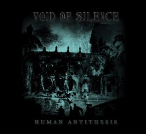
To create album covers and work with the bands allows me to keep on my relation with the musical environment that represents one of the biggest passions in my life. As often happens, I started drawing logos and put together collages for demos of local bands, but the first significant occasion was given to me by Riccardo Conforti of Void of Silence that, having known some of my oeuvres, entrusted me with the creation of the new symbol/logo for the band and the artwork for “Human Antithesis”. I’m deeply attached to this album that has become a pillar of the modern doom metal and, even today, many people speak with fondness about this great release, pointing out the balance between the musical and the visual components. Moreover, Riccardo honored my work tattooing on his nape the logo that I have designed. His gesture deeply touched me.
More recently, Diego of ATMF and Luciano of I, Voidhanger Records chosen me as art director for their labels and I would like to use this opportunity to thank them for trusting me, allowing more people to know my work.
How much does your art reflect what you perceive of the music or its themes?
I like define myself as “visual interpreter”: when I work with a band my goal is to translate visually the music and the related concept. Chasing this target I don’t try to forcedly impose my personal style or my works but to find instead the right visual elements to complete and enrich the music. That’s why I’m always open to collaborations with other artists: in specific occasions, indeed, I prefer to assume the role of art director, choosing the works of other artists that I like and making those coherent and organic with the music. When, in the making of an artwork, you have the chance, for example, to use the incredible pieces of a genius like the painter/sculptor Nicola Samorì or of the worldwide known photographer John Santerineross, you have only to enhance theirs oeuvres all possible and to create a connection between these and the songs. Recognizability is a central point for an artist in the contemporary art, but for an art director the mark of identifiability has to be the quality of your work and satisfaction of the client.
 What other artists, musicians or thinkers influence your style?
My work is extensively influenced by the art of the 1900s: equally by the first years of the century as well as by the current tendencies. Between the different art movements, the Informalism certainly had a big influence on my artistic development.
As you may have figured out at this point, I don’t follow a single procedure to realize my works, so I attend as much as possible exhibitions and galleries to meet and discover new artists and ideas. Working on artworks, I involve a mix of different media and softwares: some pieces grow out only through the pencils, others are the outcomes of computer graphics, some else come out from a mix between handcrafted and digital resources.
Are there certain themes that you naturally gravitate toward? Do you see your artwork as having a naturally bleak or desolate character?
Not at all. A key-point of my research has always been to contrast some aspect widespread in the metal extreme genre and when the bands have been sufficiently “courageous” to share my point of view, I have always tried to take distance from the common solutions. Take, for example, my artwork for the “Inter Uterum Et Loculum” of Locus Mortis: although they play a fast and aggressive traditional black metal, I have described their music drawings gentle figures and using a bright palette of colours. Even when the bands expressly requested me traditional solutions for their artworks, I have always tried to put in there some elements of innovation: from the involved technique of production to the chromatic palette. It’s hard and maybe not useful to eradicate and betray overused commonplaces, but it’s possible to innovate from the “inside” without renege the past, and to try to “educate” people to new solutions and artistic waves.
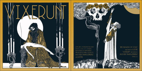
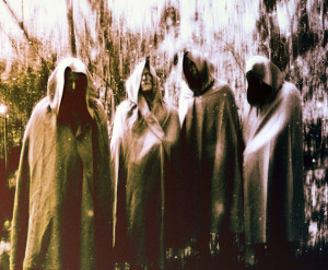 You’ve worked with altered photographs (such as in “Aus Der Transzendenz” 2012 Promo Pics) which bring out a majestic nature to your subjects. What is your technique here? How do you decide on the balance between obscurity and clarity? Does your alteration direct the eye to a focal point in each piece?
I usually adapt the photo manipulation technique to the characteristics of the band. In this case, the band asked me to place the group in an “unreal” and “magical” dimension. So, I operated on the background, working also on colors, tones and lights. I didn’t alter the eyes of the members: they were already striking a theatrical pose in the picture.
What pieces of your art have been displayed in exhibitions? Where can people expect to see your work next? Will you expand beyond album covers?
The original pieces that I created as artwork for the debut of my industrial project Eidulon on Malignant Records have been part in contemporary art exhibitions. These stark black and white illustrations were inspired by Taschism and Spatial Art.
 Who do you think are the most historically important and/or best metal album cover artists of all time?
I don’t think that there is a most important cover in metal history; I consider, however, some artworks and artistic choices crucial for the development of the “heavy metal aesthetics”: between the late ’70s and mid-’80s, bands like Back Sabbath, Iron Maiden, Judas Priest, Venom, Mercyful Fate and Metallica laid the foundation to the process of identification of those symbols and themes that have differentiate the HM from the other genres. This process has gone to influence the audience on how they perceive themselves and, in its turn, the aesthetics of the new bands.
Despite this developing trend, in the 80s, the different bands were visually recognizable and there still was an “artisanship” in producing artworks. By moving to 90s, with the diffusion of PCs, the computer graphics software became something that everybody can have and, even if there’s nothing negative about that per se, the “layering process” permitted by these new instruments resulted in a standardization of metal artworks that started to look too similar to each other.
In the last ten years, with the widening of the process of fragmentation of subgenres and publics, the need to stand out visually is becoming increasingly important. As mentioned before, recognizability is a focus point for an artist in the contemporary market, so it’s implausible, even in the extreme genres, to overlook the visual elements of a musical project.
Where can we expect to see your work in upcoming musical and artistic projects?
I just finished the artwork for the re-recording of the debut album of Janvs, “Nigredo”, on Avantgarde Music and I will cooperate very soon with Benjamin Vierling for the new Spectral Lore album. At the same time, I would expand my experiments to video-art and, since now I’m working between Montréal and Toronto, I hope to find this opportunity and new inputs too.
I will try to develop new joint collaborations and I would like the chance to work with other great graphics like Metastazis from France, Trine + Kim from Norway and with a band like Elend that I follow and appreciate from the very beginning of their glorious career.
I recently started my Facebook page, so anyone who might be interested can follow my future works there.
Thank you for this interview.
Check out Francesco’s music project Visthia here.
Tags: album covers, art, Art Direction, Francesco Gemelli

I like to believe that every death metal fan has seen a Dan Seagrave cover at one time or another. The man has painted the covers of some of the most influential death metal albums out there – we’re talking Morbid Angel, Suffocation, Entombed, Pestilence, Dismember, Gorguts and Carnage among others. Some of those covers have undeniably somewhat added to the spirit of death metal mythology.
Seagrave is a self-taught Brit, initially inspired by the rural and urban surroundings of his native Ravenshead (near Nottingham). That the young artist’s paintings would fit the imagery of death metal music makes sense when considering how his early influences included John Martin, a Romantic painter keen on apocalyptic and chthonic scenery, and M. C. Escher, a graphic artist interested in labyrinthine visual paradoxes. Top it off with some Vincent van Gogh, Leonardo da Vinci and early sci-fi films, like Alien, and the road to metal doesn’t seem entirely unlikely. Seagrave is nevertheless (and hardly surprising) more into architecture than other visual arts:
I like to see the layers of history in buildings, things like old signs or hand painted fading billboards – that kind of thing, and a little bit of seedy urban decay.
The typical Seagrave painting these days often seems to delve in a sea of thorns or a mess of jagged bark that’s come alive in some decrepit, chaotic universe. Some of his works are, by contrast, highly symmetrical pieces (think The Ultimate Incantation or Like an Ever-flowing Stream). In all his works, however, there’s a penetrating attention to detail. You can spend an awful lot of time discovering all the elements of the cover of, say, Effigy of the Forgotten.
Seagrave’s early paintings used gouache paint, which, while rather dull, is more tolerant of the meticulous. Whereas these early works are reminiscent of morbid still lifes, his more recent paintings – mostly painted with acrylics – experiment more with gnarly shapes, twisted movements and vertiginous perspectives.
Seagrave painted a lot of cover art from 1988 to 1994, more or less until the advent of computer graphics (and the death of a lot of underground metal). He prefers to work instinctively and hardly uses any reference material. He is, as he expresses it, “trying to convey”. Seagrave’s legacy should indeed remind us that real paintings pertain more to the authenticity of metal culture than any Photoshop production:
5 CommentsI did around 40 covers, computer graphics were cheaper alternatives, but I think paintings are far more interesting to look at. And people realize that computer art is as different to painting as photography, it’s simply another medium which is why things are beginning to level off again.
Tags: album covers, dan seagrave
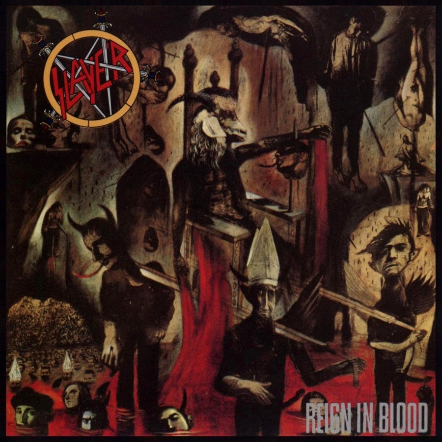
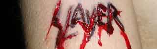
Damn good albums need damn good album covers. Kerry King of Slayer once mentioned how the band’s music makes it sound as though the world is about to end, and artist Larry Carroll’s visual representations are not far off the mark. Carroll started collaborating with Slayer in 1986 and has painted four of their album covers so far. Some of those albums are among the best in metal, and so, I would argue, are the covers.
Carroll says he usually makes a collage out of drawings and photographs. This was before Photoshop was born, hence Carroll used a good ol’ Xerox machine to multiply, resize or otherwise manipulate the individual pieces. The coffins in Seasons in the Abyss are a good example.
At the time of painting the Reign in Blood cover, Carroll was doing political illustrations for various newspapers, and had not done album covers before. Producer Rick Rubin contacted Carroll, who was left with more or less free reins, building upon “a rough idea of something about a goat’s head”. Once finished, however, it turned out that his unique style was not an obvious choice for Slayer. But once the mother of one of the band members commented that the painting looked “disgusting”, any doubts seem to have melted away (in a living inferno).
And sure enough: there is something nauseating about Carroll’s Slayer covers, as though they were depicting the sickest aspects of society of the 1980s. Not only could modern life come back to us in dreams as collages of twisted, disproportionate human shapes with pope hats and erect penises (cf. RiB), but the netherworldly use of colour in Carroll’s paintings was one of a kind. Black and red are the classic colours of blood/fire/death – Carroll’s black strokes are high-contrast burns reminiscent of coal or oil – but to this Carroll added revolting tints of green, brown and yellow, a fitting backdrop to the fires of mental hell.
But rather than depress us, Carroll’s paintings are majestic. Carroll shows that he, like Slayer, is fascinated by death, and, like some fallen Lucifer, makes a stroll south of heaven an enticing exploration of potential.
6 CommentsTags: album covers, slayer
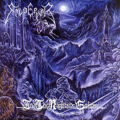
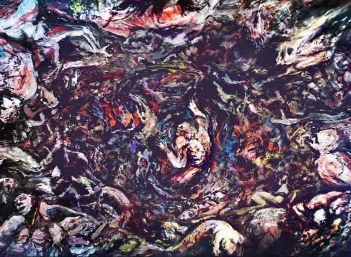
Inspired by Bosch, Dürer and Caspar David Friedrich, Kristian “Necrolord” Wåhlin has painted album covers for shiploads of underground bands since the early 90s (Therion and Dissection among others), but his most important and most striking contribution is probably the cover of Emperor’s In the Nightside Eclipse (1994).
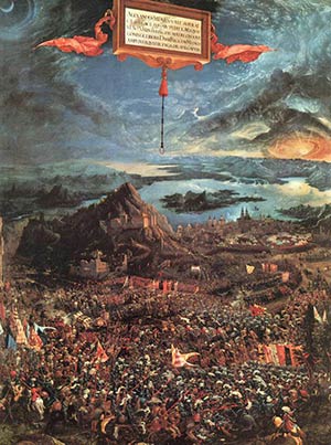 Some of its style and composition takes me back to Albrecht Altdorfer’s anachronistic oil painting The Battle of Alexander at Issus (1529), but true to the bleak genre of black metal the cover of ItNE is practically monochrome, which is rather typical of Wåhlin’s paintings at large (as seen in his paintings for Sacramentum’s Far Away From the Sun and Dark Funeral’s The Secrets of the Black Arts).
Wåhlin nevertheless manages to capture much of the grandeur sought by Emperor in those days. He allows us to delve in a detailed landscape of rugged forests, cold mountains and an army of monsters seemingly popping out of the ground in a setting of strange angles and charmingly inconsistent perspectives. High above, emanating from a crack in the clouds, Death sweeps his scythe across the sky, resonating the lofty keyboard phrases in the music of this album. The whole scene is awash in the light of the moon, gazing at us like a gate to eternity (try to outstare it during the finale of Inno a Satana …). The incorporation of Death seems to have been a way of providing a sense of iconic continuation, referring back to Emperor’s début EP which depicted a section of Gustave Doré’s engraving Death on a Pale Horse (Revelation). (The use of old engravings – especially those of Doré – seems a favourite means of visual expression in the universe of Emperor.)
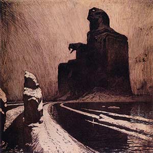 I always assumed that the otherworldly castle and the winding path leading to it were reminiscent of that of a certain bloodsucking count. This is probably no coincidence: have a look at the lyrics of the song Beyond the Great Vast Forest. Not only does it refer to Werner Herzog’s film Nosferatu (1979); parts of the story of the over-the-top film Bram Stoker’s Dracula (1992) – which was immensely popular around the time of ItNE’s inception – had also found its way into the lyrics, and the solitary structure of that film’s castle and its inspiration, František Kupka’s The Black Idol (1903), somewhat parallels the idea of the castle on display here.
Ultimately, the cover of In the Nightside Eclipse confirms the nature of its music as slightly cheesy yet chillingly sincere, a satisfying visual representation of one of the best albums of the genre.
4 CommentsTags: album covers, emperor, in the nightside eclipse, necrolord
![[AllCDCovers]_darkthrone_transilvanian_hunger_1994_retail_cd-front](https://www.deathmetal.org/wp-content/uploads/AllCDCovers_darkthrone_transilvanian_hunger_1994_retail_cd-front.jpg)
With the arrival of A Blaze in the Northern Sky, Darkthrone presented a new musical evil with the help of a new visual evil. The first four of Darkthrone’s black metal albums depicted a sole band member in a state of aggression, triumph and/or despair, in black-and-white photos stripped of all decoration, reflecting the intentionally unaesthetic music of the band.
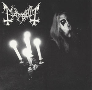 This minimalist approach culminated both visually and musically with Transilvanian Hunger, showing a photocopied, grainy picture of Fenriz dehumanized beyond recognition, holding a candelabrum and presumably screaming his lungs out in the night. Some of its appeal lies in its ambiguity; feelings of futility, anger and power are intermixed, widening its significance.
Although Darkthrone’s visual idea was immediately inspired by Mayhem’s Live in Leipzig, its monochromatic, Xeroxed quality also has an eerie resemblance to Black Sabbath’s Vol. 4 from twenty years earlier and its anguished enigmatic quality to Edvard Munch’s The Scream even further back in history. The parallel is not entirely farfetched: it echoes the troubled mind of Fenriz himself, who reportedly loves art that comes from “the exhaustion of easy life”. To black metal fans the Transilvanian Hunger cover is presumably the one archetypical image of what “necro” signifies, much like The Scream is still very much considered the face of existential anguish.
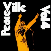 The “necro” imagery, however, may have been unintentional: In Precious Metal: Decibel Presents the Stories Behind 25 Extreme Metal Masterpieces, Fenriz asserts that mere photocopies from the TH photo session were the only thing he could find at the time to send to Peaceville Records, implying that the same picture could have been reproduced in a more polished fashion. But it doesn’t seem entirely unlikely that the use of a photocopy was inspired by Peaceville’s 1992 compilation album, Peaceville Volume 4, spoofing both cover art and title of the famous Black Sabbath album mentioned above and containing one of Darkthrone’s pre-TH songs, implying that the use was deliberate after all. (Rabid speculation is any fan’s right, right?)
In any case, the cover of Transilvanian Hunger effectively summarized its music by a single iconic image and was later emulated by hordes of lesser bands and is to this day worn on t-shirts by serious music lovers and the occasional hipster alike.
8 CommentsTags: album covers, Black Metal, darkthrone, Transilvanian Hunger