Antiviral (2012)
Directed by Brandon Cronenberg
108 minutes
Death metal and horror films go hand in hand. Screaming victims, howling chainsaws, death and destruction, subjugation and helplessness, existential angst and nihilistic outcomes. But what about death metal and a film that crosses horror, suspense, sci-fi and disturbingly investigative psychological tension?
Brandon Cronenberg, the son of edge-of-insanity filmmaker David Cronenberg, directed Antiviral which hit the screens in 2012. Following in the family tradition, he peels back the layers of justification and shows us a metaphor for our psychology in this odd and disturbing modern time. Unlike his Dad, Brandon offers more of a sense of personality horror; this is abundantly character-driven in addition to being concept-driven.
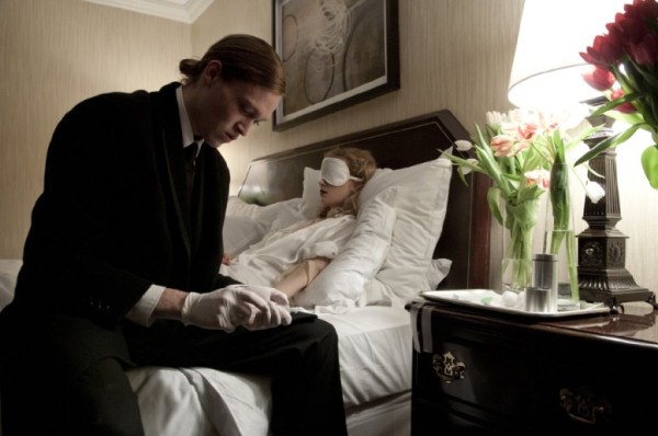
In this tense film, which seems to be set in an alternative present, celebrity culture has reached a peak mania. People are so besotted with the celebrity experience that there is a lucrative trade in infections that have their origin in celebrities. A specialized industry contracts with celebs for their diseases, harvests those diseases and then reproduces them so that ordinary people can infect themselves and share an experience with the stars of the big screen.
The biggest of these stars is Hannah Geist, a starlet of comparable stature among the fawning life-dropout masses as Jennifer Lawrence back in our reality. She is worshiped by the herd and represents top-notch product for those who wish to sell diseases. Cronenberg emphasizes this with shots of people who act like slow-motion zombies, lost in an orgiastic reverie of union with celebrities, the focal point of social interest in the culture.
Brandon offers more contrast-based filmmaking than his father. Where the elder Cronenberg relishes the organic, the younger relishes the symbolic and the disturbingly out of place. He films in a kind of breathless patience that is moving full speed ahead to notice everything, which requires a manic (Adderall-like) focus on stillness and the smallest of events. He shows characters confronting their own limitations and fears, and as a result, has characters who do more than act out an experience. They grow, even if in dubious ways.
Much like the fiction of William Gibson, Antiviral is heavily metaphorical and reveals some unsettling truths about our rather mundane world through an exotic one. In doing so, Cronenberg creates an atmosphere of the surreal and disturbing that infiltrates all thoughts of comfort and stability and upends them with a view of the dark rotten core of own celebrity-crazed culture.
No Comments

 The “first ever death metal band from the Netherlands”,
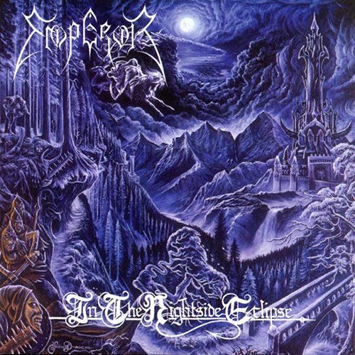
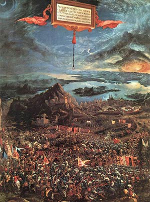 Some of its style and composition takes me back to Albrecht Altdorfer’s anachronistic oil painting The Battle of Alexander at Issus (1529), but true to the bleak genre of black metal the cover of ItNE is practically monochrome, which is rather typical of Wåhlin’s paintings at large (as seen in his paintings for
 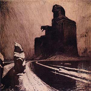 I always assumed that the otherworldly castle and the winding path leading to it were reminiscent of that of a certain bloodsucking count. This is probably no coincidence: have a look at the lyrics of the song Beyond the Great Vast Forest. Not only does it refer to Werner Herzog’s film Nosferatu (1979); parts of the story of the over-the-top film Bram Stoker’s Dracula (1992) – which was immensely popular around the time of ItNE’s inception – had also found its way into the lyrics, and the solitary structure of that film’s castle and its inspiration, František Kupka’s The Black Idol (1903), somewhat parallels the idea of the castle on display here.
![[AllCDCovers]_darkthrone_transilvanian_hunger_1994_retail_cd-front](https://www.deathmetal.org/wp-content/uploads/AllCDCovers_darkthrone_transilvanian_hunger_1994_retail_cd-front.jpg)
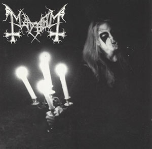 This minimalist approach culminated both visually and musically with Transilvanian Hunger, showing a photocopied, grainy picture of Fenriz dehumanized beyond recognition, holding a candelabrum and presumably screaming his lungs out in the night. Some of its appeal lies in its ambiguity; feelings of futility, anger and power are intermixed, widening its significance.
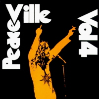 The “necro” imagery, however, may have been unintentional: In Precious Metal: Decibel Presents the Stories Behind 25 Extreme Metal Masterpieces, Fenriz asserts that mere photocopies from the TH photo session were the only thing he could find at the time to send to Peaceville Records, implying that the same picture could have been reproduced in a more polished fashion. But it doesn’t seem entirely unlikely that the use of a photocopy was inspired by Peaceville’s 1992 compilation album, Peaceville Volume 4, spoofing both cover art and title of the famous Black Sabbath album mentioned above and containing one of Darkthrone’s pre-TH songs, implying that the use was deliberate after all. (Rabid speculation is any fan’s right, right?)
 In an interview with Norwegian news site
 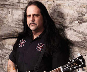 Mike Scaccia and his mates in