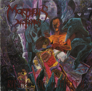
 Most of us who emerged into the classic death metal milieu are familiar with Morpheus Descends‘s classic album Ritual of Infinity and its striking cover art that remains controversial to this day. The illustrator who created that polarizing work has launched an online presence and is designing metal art of similar caliber.
Morpheus Descends rose after the early years of American death metal but before the solidification of the style, and created a grandfather template for both New York death metal and heavy percussive death metal in general. Their most notable influences were on bands like Suffocation and Incantation, who took the blueprint that Morpheus Descends created and pushed it to new heights of complexity and technicality.
Brad Moore, who designed the iconic cover, was able to give us a few moments of his time to describe his art, life and time with Morpheus Descends. For those curious about the band, our interview with Morpheus Descends is a good place to start, or peruse our brief explanation of the band and its context.
How did you get started in art?
Like many who decide to become full-time artists, I began in grade school as the guy who could draw really well. I specialized in dinosaurs, hot rods and sci-fi. My classmates always got me to draw for them. It was my Junior High art teacher who first made me aware, that since I spent all day drawing anyway, why not make it my career and be paid for it? My brain did a back flip, as I did not know such a thing was possible, having been brought up in a very small country town. I credit my High School art teacher, Barbara Allen, who is now a top portrait painter, and two professors in college, Herbert Fink, and Ed Rollman Shay. They REALLY showed me the path! Eternal gratitude flows forth.
How did you get started in metal? Were you a metalhead? Did you “study” any heavy metal art?
Although my career began as a horror style comic book artist (I worked for comics publishers like Fathom Press, Boneyard Press, Graphomania, London Night Studios, etc) I was always a metalhead! When bands would tour, they often bought and read comics on the road. It wasn’t long at all before I got mail, asking me to draw or paint t-shirt designs, logos, cassette, and CD covers. Soon after, ‘zines came, asking for gory covers, inside illustrations, and dark comic strips. I was doing 3-5 fliers a week back then for metal shows. I didn’t really study any “metal” artists, as I have broad tastes, and enjoy a ton of different stuff. I’ve been to Richard Corben’s house, and viewed the original painting he did for Meat Loaf’s Bat out of Hell. I did an art exhibit with H.R. Giger in Switzerland and saw his sketches for what became covers for Celtic Frost and Emerson, Lake, and Palmer. But I’ve always had my own approach; no one has ever said that my art resembles the work of anybody else.
What other influences exist on your art, like other artists, morbid dreams, etc?
Dreams, DEFINITELY!!! I’m also very into the films of European directors, and the famed Polish Poster movement. I’m an ardent Surrealist.
How did you end up doing the Morpheus Descends cover? Are you a Morpheus Descends fan?
I was, and still am, a major Morpheus Descends fan! When I first got and heard their cassette “Corpse Under Glass,” I was hooked, feeling that they were the heaviest I had ever heard at that time. The band, as luck would bequeath, turned out to be horror comics readers who knew of my work. Ken, their bassist, wrote me, and we discussed the possibilities for the art that became the cover of Ritual of Infinity. In the original sketch, the “wizard” character had his hands raised, and an infinity symbol carved into his bleeding chest. I think his eyes might have been bleeding, as well, and in one hand, he held a bloody, ancient scroll. After another phone discussion, the “Carven-Diety” had its hand positions changed, and the “wizard” was now in the pose we all have grown used to: that of sawing the head off an androgynous cadaver. An ad for Ritual of Infinity featuring the debut of the cover art in b/w was published as the back cover of gore/horror comic book Cadaver, issue # 1, by Fathom Press, in ’92’-93. Funny thing: the record company’s name (J.L. America) is misspelled.
The Morpheus Descends Ritual of Infinity cover art uses some rather unorthodox (for metal) color combinations. What inspired your choices here?
Yes, the issue of the cover has stirred as much hate, as it has admiration, and I think that’s the best thing you can hope for. The colors I chose WERE very strikingly different for what was happening with other illustrators at that time. (Or, for any time, really.) The painting was a combination of oil paint and Rotring dyes, and it strode counter to the monochromatic approach that most others were doing. When I look even now at a box full of CDs at a merch table, I am struck by how many generic looking, grey and black compositions I see. Most are great looking on their own, but a table full of them are monotonous, and do disservice to the music and bands. I knew Morpheus Descends weren’t going to be on MTV, any time soon, so their CD cover, love it or loathe it, had to nail you across the room.
You’ve just gone online. Are you offering other services to metal musicians? What other directions do you hope to take your art in?
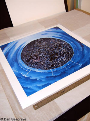
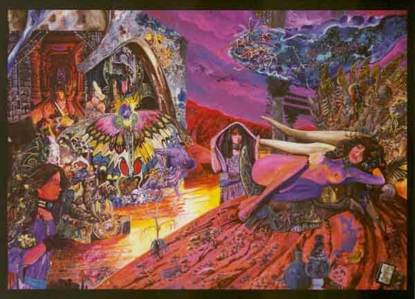
I just finished designing the T-shirts and poster for the Stoner Hands of Doom fest, as well as the T-shirt for Argus’ upcoming European tour (I did all three of their album covers); I’m working on two new CD covers, for two new bands, The Swill, and Foghound; I will have art featured in the winter issue of Churn magazine (Issue # 11); I am designing and building the special effects props for an upcoming film named “Platypossum”; and I am masterminding a civic project that I have dubbed “Mobile Murals.” Watch for the cover I did for Ed (ex-Monster Magnet) Mundell’s next solo LP; it’s one of the greatest I’ve ever done. Check out my page at bradmooreartwizard.com, or hit me up on Facebook @ Brad Moore’s Illustration Station.
1 CommentTags: cover art, death metal, death metal cover art, metal art, morpheus descends