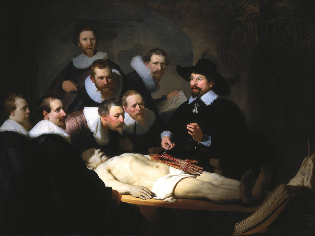
Bolivian metal band mixes native instruments, modern technique

bolivia-heavy-metal
Photo: New York Times.

One of the better developments during the past decade is that it’s now acceptable to talk about heavy metal in the mainstream press as something other than entertainment. It might even have, you know, artistic or cultural value and stuff.

A recent attempt looks at the heavy metal of Bolivia, which combines native instruments with modern underground metal technique:

The band members wore black. The lead singer screamed into his microphone and whipped his long, black hair around. The guitarists clawed at their instruments. The drummer pounded with fury. And then the panpipe player took his solo, and the fans packed into the mosh pit went into a frenzy…those songs, characterized by the use of the panpipe, known as the zampoña, and a wooden flute called a quena, have a special impact among fans.

The article makes the point that the hybrid style is more accepted among many of the people there, and that it directly references Incan cultural ideas including the ancient moral code that still lives on today in Bolivia.

Our question is: if it’s art, culture and morality there, why isn’t it art, culture and morality here?

No Comments

Tags: , , ,

Interview with album cover artist Francesco Gemelli

francesco_gemelli_urna_mors_principium_est_21


francesco_gemelli_ysengrin_lp_01Art direction for preparing album aesthetics is important for delivering a visual representation for the music that it banners. Francesco Gemelli has been providing visual artistry for numerous bands and other clients. With utmost professionalism displayed in his works, Francesco is expanding his work as art director for record labels and freelance endeavors. He’s amassed quite a hefty resume of album covers and logos.

How did you start out in art and what inspired you?

In general, growing in Italy gives to you the chance to become familiar with Art since a young age. Furthermore, in my case, the proximity to Roman and Greek archeological areas influenced my artistic imaginary that I have later developed progressively at school. I started drawing very early and, above all, I have been attracted rapidly by the computerized graphics. Indeed, I did my first experiments on an Atari St back in 1986, publishing later my first works on specialized magazines.

gemelli_vos_human_antithesis_01What encouraged you to also start creating artwork for album covers?

To create album covers and work with the bands allows me to keep on my relation with the musical environment that represents one of the biggest passions in my life. As often happens, I started drawing logos and put together collages for demos of local bands, but the first significant occasion was given to me by Riccardo Conforti of Void of Silence that, having known some of my oeuvres, entrusted me with the creation of the new symbol/logo for the band and the artwork for “Human Antithesis”. I’m deeply attached to this album that has become a pillar of the modern doom metal and, even today, many people speak with fondness about this great release, pointing out the balance between the musical and the visual components. Moreover, Riccardo honored my work tattooing on his nape the logo that I have designed. His gesture deeply touched me.

More recently, Diego of ATMF and Luciano of I, Voidhanger Records chosen me as art director for their labels and I would like to use this opportunity to thank them for trusting me, allowing more people to know my work.

How much does your art reflect what you perceive of the music or its themes?

I like define myself as “visual interpreter”: when I work with a band my goal is to translate visually the music and the related concept. Chasing this target I don’t try to forcedly impose my personal style or my works but to find instead the right visual elements to complete and enrich the music. That’s why I’m always open to collaborations with other artists: in specific occasions, indeed, I prefer to assume the role of art director, choosing the works of other artists that I like and making those coherent and organic with the music. When, in the making of an artwork, you have the chance, for example, to use the incredible pieces of a genius like the painter/sculptor Nicola Samorì or of the worldwide known photographer John Santerineross, you have only to enhance theirs oeuvres all possible and to create a connection between these and the songs. Recognizability is a central point for an artist in the contemporary art, but for an art director the mark of identifiability has to be the quality of your work and satisfaction of the client.

francesco_gemelli_urna_mors_principium_est_16What other artists, musicians or thinkers influence your style?

My work is extensively influenced by the art of the 1900s: equally by the first years of the century as well as by the current tendencies. Between the different art movements, the Informalism certainly had a big influence on my artistic development.

As you may have figured out at this point, I don’t follow a single procedure to realize my works, so I attend as much as possible exhibitions and galleries to meet and discover new artists and ideas. Working on artworks, I involve a mix of different media and softwares: some pieces grow out only through the pencils, others are the outcomes of computer graphics, some else come out from a mix between handcrafted and digital resources.

Are there certain themes that you naturally gravitate toward? Do you see your artwork as having a naturally bleak or desolate character?

Not at all. A key-point of my research has always been to contrast some aspectŽ widespread in the metal extreme genre and when the bands have been sufficiently “courageous” to share my point of view, I have always tried to take distance from the common solutions. Take, for example, my artwork for the “Inter Uterum Et Loculum” of Locus Mortis: although they play a fast and aggressive traditional black metal, I have described their music drawings gentle figures and using a bright palette of colours. Even when the bands expressly requested me traditional solutions for their artworks, I have always tried to put in there some elements of innovation: from the involved technique of production to the chromatic palette. It’s hard and maybe not useful to eradicate and betray overused commonplaces, but it’s possible to innovate from the “inside” without renege the past, and to try to “educate” people to new solutions and artistic waves.

francesco_gemelli_aus_der_transzendenz_p01You’ve worked with altered photographs (such as in “Aus Der Transzendenz” 2012 Promo Pics) which bring out a majestic nature to your subjects. What is your technique here? How do you decide on the balance between obscurity and clarity? Does your alteration direct the eye to a focal point in each piece?

I usually adapt the photo manipulation technique to the characteristics of the band. In this case, the band asked me to place the group in an “unreal” and “magical” dimension. So, I operated on the background, working also on colors, tones and lights. I didn’t alter the eyes of the members: they were already striking a theatrical pose in the picture.

What pieces of your art have been displayed in exhibitions? Where can people expect to see your work next? Will you expand beyond album covers?

The original pieces that I created as artwork for the debut of my industrial project Eidulon on Malignant Records have been part in contemporary art exhibitions. These stark black and white illustrations were inspired by Taschism and Spatial Art.

francesco_gemelli_600pxWho do you think are the most historically important and/or best metal album cover artists of all time?

I don’t think that there is a most important cover in metal history; I consider, however, some artworks and artistic choices crucial for the development of the “heavy metal aesthetics”: between the late ’70s and mid-’80s, bands like Back Sabbath, Iron Maiden, Judas Priest, Venom, Mercyful Fate and Metallica laid the foundation to the process of identification of those symbols and themes that have differentiate the HM from the other genres. This process has gone to influence the audience on how they perceive themselves and, in its turn, the aesthetics of the new bands.

Despite this developing trend, in the 80s, the different bands were visually recognizable and there still was an “artisanship” in producing artworks. By moving to 90s, with the diffusion of PCs, the computer graphics software became something that everybody can have and, even if there’s nothing negative about that per se, the “layering process” permitted by these new instruments resulted in a standardization of metal artworks that started to look too similar to each other.

In the last ten years, with the widening of the process of fragmentation of subgenres and publics, the need to stand out visually is becoming increasingly important. As mentioned before, recognizability is a focus point for an artist in the contemporary market, so it’s implausible, even in the extreme genres, to overlook the visual elements of a musical project.

Where can we expect to see your work in upcoming musical and artistic projects?

I just finished the artwork for the re-recording of the debut album of Janvs, “Nigredo”, on Avantgarde Music and I will cooperate very soon with Benjamin Vierling for the new Spectral Lore album. At the same time, I would expand my experiments to video-art and, since now I’m working between  Montréal and Toronto, I hope to find this opportunity and new inputs too.

I will try to develop new joint collaborations and I would like the chance to work with other great graphics like Metastazis from France, Trine + Kim from Norway and with a band like Elend that I follow and appreciate from the very beginning of their glorious career.

I recently started my Facebook page, so anyone who might be interested can follow my future works there.

Thank you for this interview.

Check out Francesco’s music project Visthia here.

francesco_gemelli_lustre_adt_21

No Comments

Tags: , , ,

Death metal as art in the media

ramon_cazares-abolishment_of_fleshAs metal continues to grow in popularity, outsiders to the genre find it more appealing. They see it as an unknown region, or an exotic culture, and in comparison their lives seem drab. What is it that makes hordes of people headbang to violent and abrasive music?

This was the question the Amarillo Globe News posed to death metal band Abolishment of Flesh and it received an answer it might not have been expecting.

The band painted a picture of death metal different from what is commonly presented in the media:

“There are a lot of different things going on at the same time,” [guitarist] Cazares said. “It’s very comparable to classical music.”

“We have a lot of weird time signatures and different changes like classical music does,” bass player Chuy Camacho said. “There can be three different things going on in the music at the same time.”

In other words, rather than the circular key-centric two-part composition of rock and pop music, death metal uses chromatic scales to develop an internal dialogue and motif evolution through pattern as opposed to harmony alone, such that notes are relevant more to previous notes and riff shapes than they are to a sense of key or rhythm.

In death metal, notes stream forth in multiple tones and directions, creating a tapestry of sound, similar in goal of a symphony: each part is musically literate on its own, yet when put together creates something that transcends each individual instrument.

When musing on why death metal is not popularly regarded as an art form, the band speculated that the genre has been overtaken by bands that have confused aesthetics with actual content:

“We don’t get taken seriously because other bands make a joke out of it — try to get as perverted and as gory as they can,” Camacho said.

Not content with being a sideshow, the band decided to forge ahead and create music with quality control. Playing old-school style death metal with melodic interludes; the band creates a style of music that appeals to both veteran fans of the genre and newcomers that may discover older classics through discovery of the techniques presented.

And the reason the band plays this type of music?

To Cazares, death metal “talks more about what’s real or what’s going on in life.”

Thus the essence of Death metal described: piercing the veil of deception and beholding reality.

http://www.youtube.com/watch?v=8BH6MM6EEss

http://www.youtube.com/watch?v=4rmEp4c1LFc

5 Comments

Tags: , ,

“Altars of Madness” art exhibit opens at Casino Luxembourg

altars_of_madness_exhibitFrom May 18 through September 15 of this year, a new kind of art exhibit is coming to the notable Casino Luxembourg gallery. This exhibit, entitled Altars of Madness, “displays and brings together the works of art of a generation of artists affected by extreme metal” through the use of imagery and content similar to that in extreme metal.

Even better, the exhibit explores the origins of metal and explains some of the purpose behind these genres. “Extreme metal emerged in the second half of the 1980s through three distinct musical genres with different principles, aesthetics and evolutions: grindcore, death metal and black metal. Like all underground cultures, extreme metal is not something that can simply be passed on: you have to experience it on your own,” says the exhibit program. This is a far cry from the media treatment of metal in the 1980s, 1990s and even 2000s where it was viewed as a sort of hard rock with better costumes.

The exhibit is divided into three parts, corresponding to those three genres. “Lucid fairytale,” “Death is just the beginning,” and “Dark matter landscape” each reflect the different values of each period. The grindcore exhibit “emphasises the political dimension of extreme metal,” by which the creators seem to mean grindcore. The death metal exhibit uses memento mori and vanitas symbolism to embrace mortality. Finally, the black metal exhibit explores nihilism, violence, Satan and “the romantic or symbolist note to black metal” which is a recurring theme.

On the whole, this exhibit explores metal in a way that is rarely done and needs to be done more. It’s not surprising that many of the artists listed are either experienced within the genre, used by the genre, or may even be pseudonyms, including Matthew Barney, Nicholas Bullen, Larry Carroll, Grégory Cuquel, Damien Deroubaix, Seldon Hunt, Gregory Jacobsen, Theodor Kittelsen, Harmony Korine, Élodie Lesourd, Juan Pablo Macías, Maël Nozahic, Torbjørn Rødland, Steven Shearer, Mark Titchner, Gee Vaucher, and Banks Violette. You might spot Nicholas Bullen and Theodor Kittelsen right away, as well as metal popularizer Harmony Korine (Gummo).

For more information, see the exhibit program or visit the gallery page.

No Comments

Tags: , ,

Introduction to Literature: Heavy Metal as a Literary Genre

martin_jacobsen-heavy_metal_as_a_literary_genreAfter years of people wondering about the connections between metal and literature, a thoughtful university professor listened to his students and as a result, has created a college literature course that uses metal lyrics to teach sentence structure and literary technique.

In one of his other classes, he diagrammed a sentence using the lyrics from Iron Maiden’s “Out of the Silent Planet” and found that students enjoyed the relevant yet thoughtful source material. As a result, Professor Martin Jacobsen launched a new class this year, Introduction to Literature: Heavy Metal as a Literary Genre.

According to the course syllabus, the class will “examine the forty-year history of heavy metal, interrogate major themes and how they persist and/or change with(in) the principal metal movements and sub-genres, and speculate as to the potential literary future of heavy metal.” Jacobsen has created a private Facebook group for the page and the class will use an etext for the text book.

To all of us here who have been collecting and noting the similarities between heavy metal and Romantic literature for some time, it is gratifying to see that someone else has a similar vision. Also, this class sounds fun as hell. Lucky students to have such an interesting experience!

9 Comments

Tags: , ,

Rembrandt – The Anatomy Lesson

Metal isn’t the only artform in history to portray sick imagery. Back in the “good old days” (18th century and below), when people were less afraid of seeing all sides of reality, even the most uncomfortable, genius artists made artworks like our pick of today: Rembrandt van Rijn’s “The Anatomy Lesson of Dr. Nicolaes Tulp”.

Fitting as the insert of an Autopsy or a Carcass album, this painting shows the artist’s preference for the contrast between dark and light, with the latter only to draw more attention to the former (like metal does). The image itself portrays the urge to study the morbid in order to bring more health (again, like metal does). Its exquisite aesthetic details are carefully crafted to further draw us onto the imagery, even if we could initially feel repelled by such, and when the contemplation ends we finally see the subject as a normal, natural thing (metal’s best albums tend to do that as well).

Besides, it looks fucking metal, what else could you possibly want from it?

No Comments

Tags: , , ,

Classic reviews:
A B C D E F G H I J K L M N O P Q R S T U V W X Y Z